LOADING 0%

 design & brands

brocki
bielkowski

We build brands, websites and systems that help companies communicate more clearly and build greater trust.

How we think

MESSAGE AUDIENCE FORM

First, we look for meaning, audience and the right message. Only then do we give it form.

Promise

BRANDS
THAT NEVER
BREAK

We strengthen the way companies talk about themselves, build their presence and create things that work well and stay memorable.

White classical sculpture on a light background

Your work matters. It deserves to be shown to the world in a way that reflects its value. We create brands and websites that help others see the value in what you do. Good design should build trust, support growth and strengthen your reputation.
We start by understanding your work.
Only then do we give it form.

01 / 03

MIBROX

Process architecture.
Make room for growth.

Type
Landing page
Screens
14
Audience
B2B business owners / team leaders

Goal

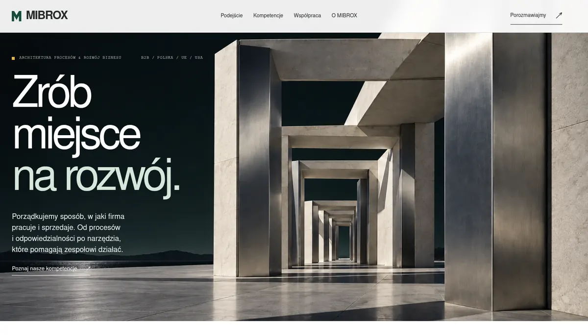
Translate operational complexity into a clear path toward a conversation.

Scope

Branding / Digital

Color palette

  • #164c3b
  • #242827
  • #66716a
  • #edf1ec
  • #ffffff
  • #e3b84b

Why it looks this way

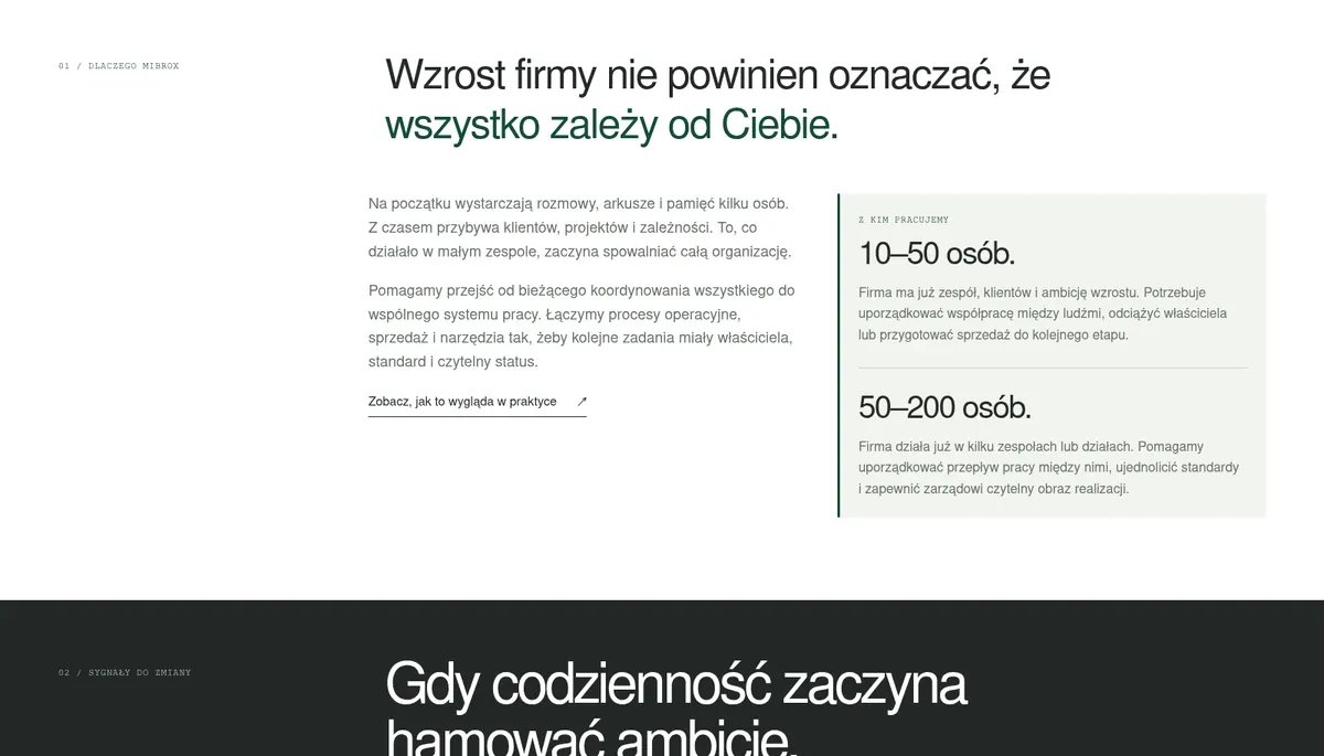
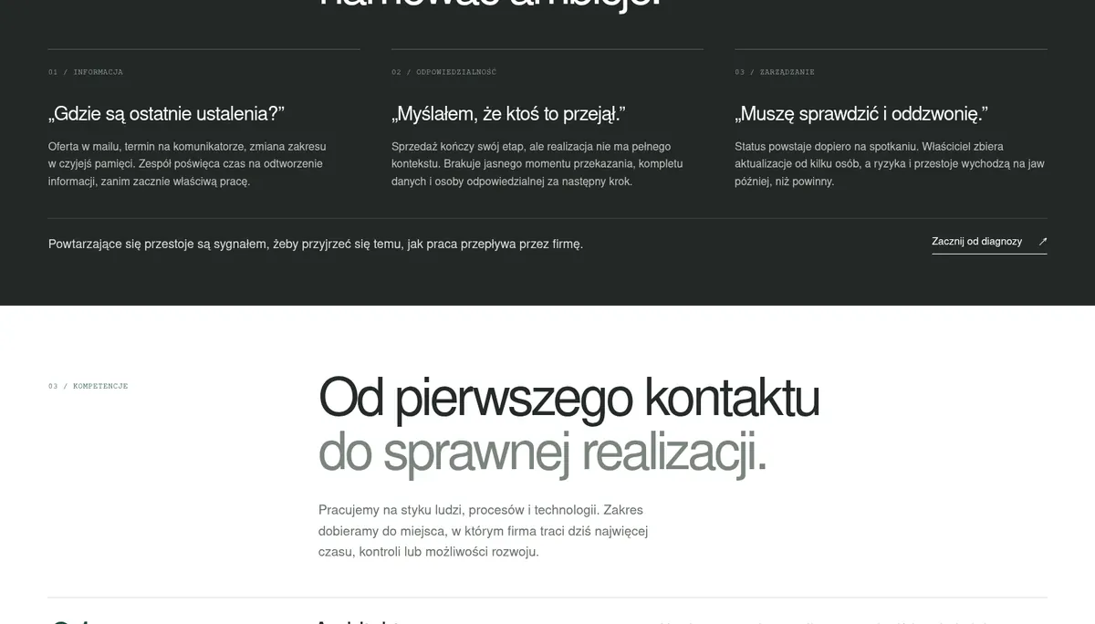
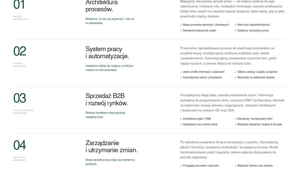
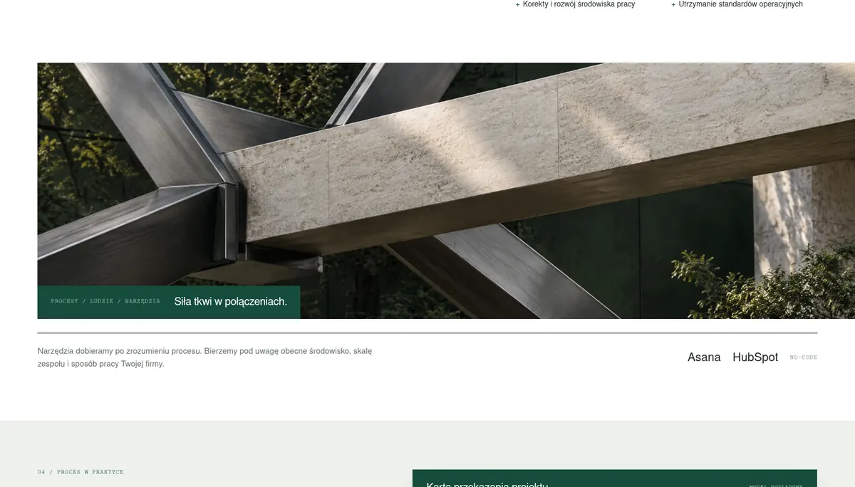
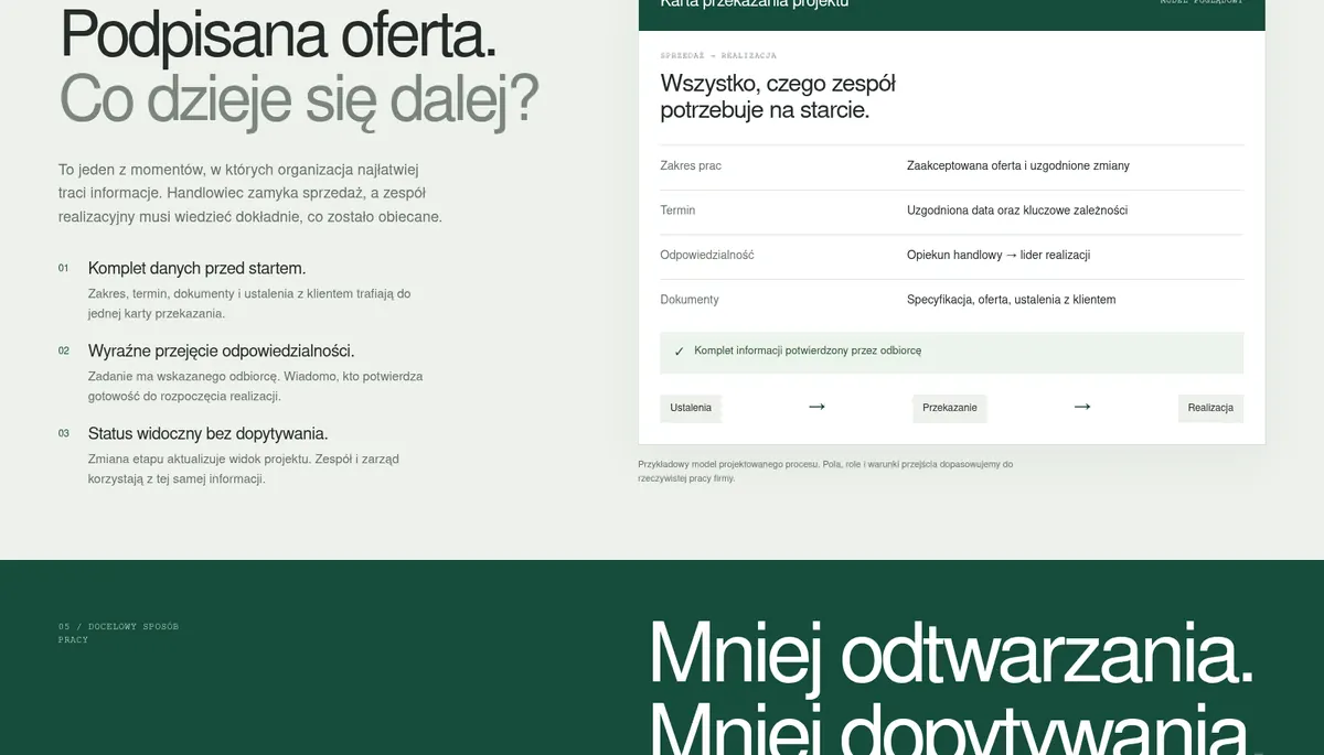
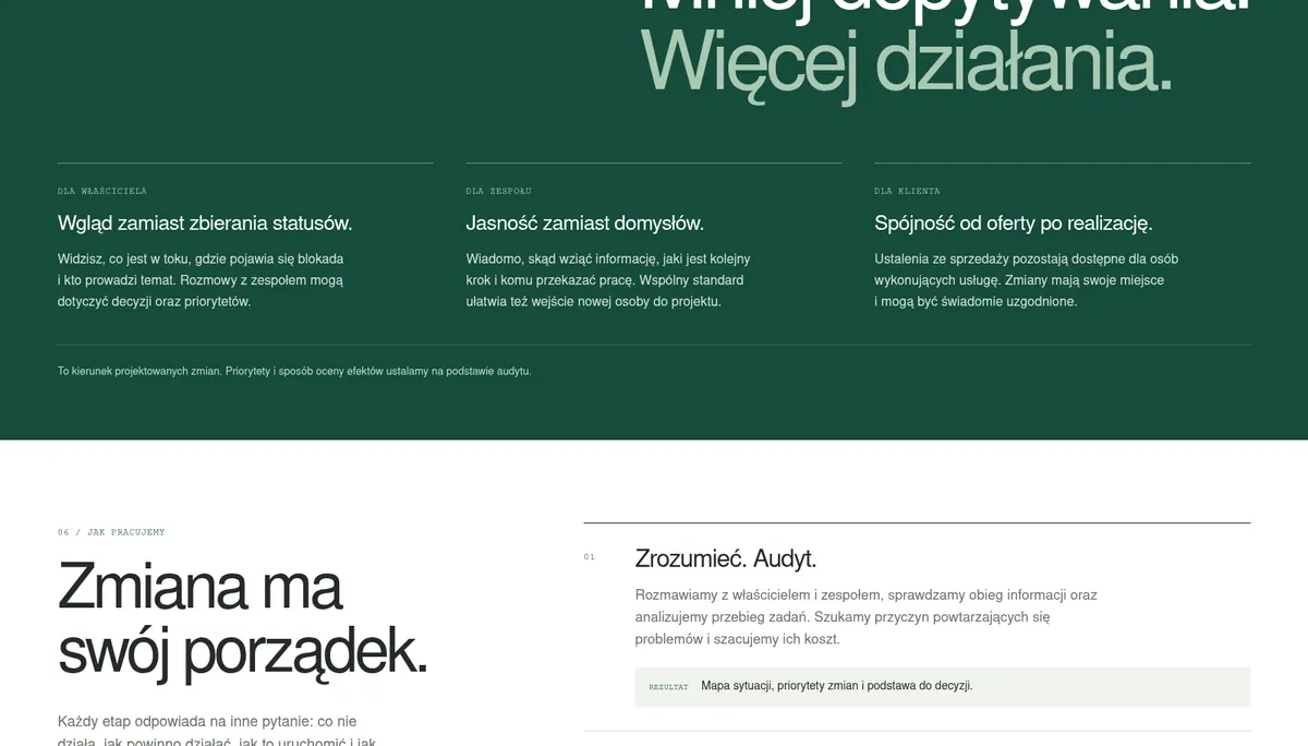
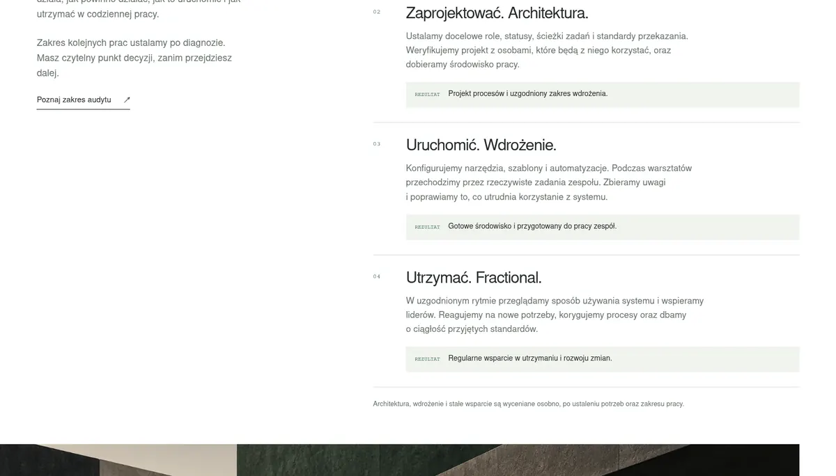
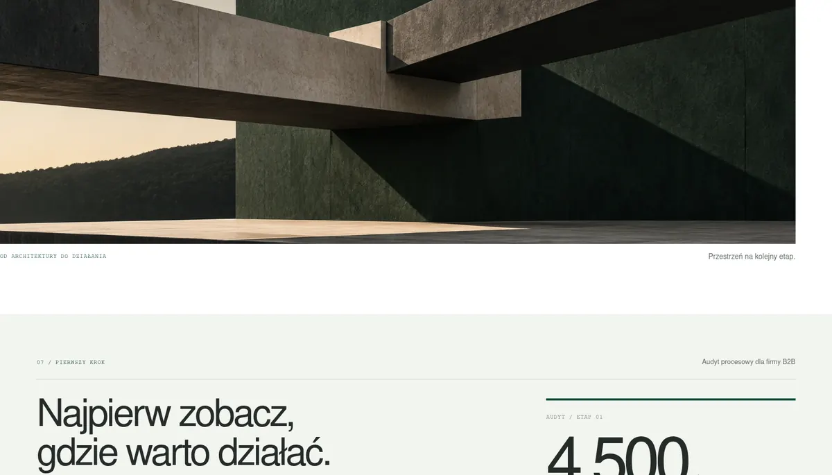
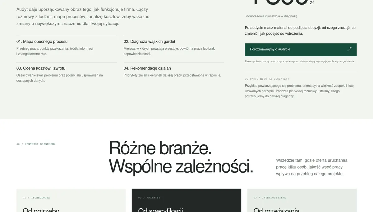
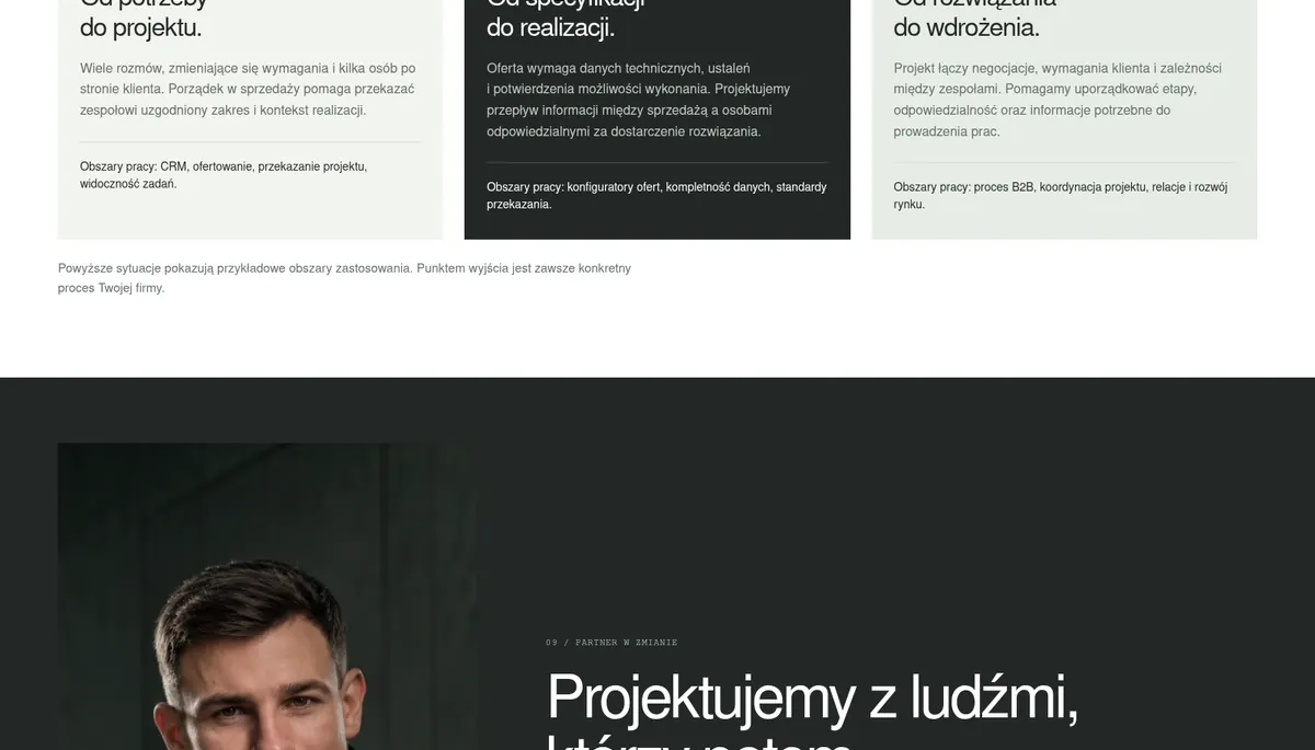
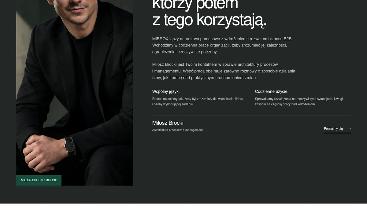
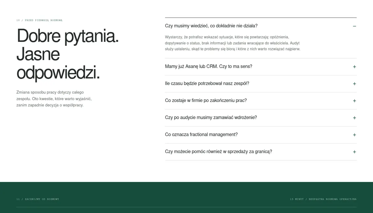
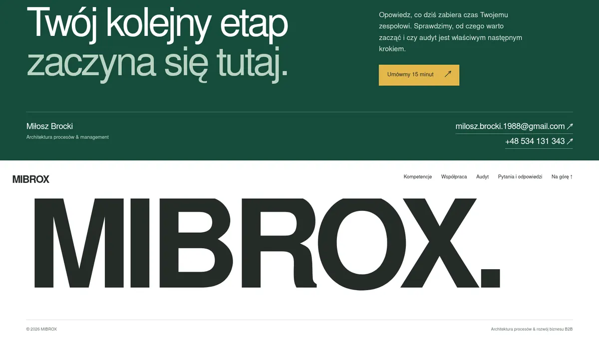
The project is built on structure, clarity and order. It reflects MIBROX’s work: organizing complex processes and creating room for growth. Every element has a place and a purpose.

MIBROX — website segment 1 of 14MIBROX — website segment 2 of 14MIBROX — website segment 3 of 14MIBROX — website segment 4 of 14MIBROX — website segment 5 of 14MIBROX — website segment 6 of 14MIBROX — website segment 7 of 14MIBROX — website segment 8 of 14MIBROX — website segment 9 of 14MIBROX — website segment 10 of 14MIBROX — website segment 11 of 14MIBROX — website segment 12 of 14MIBROX — website segment 13 of 14MIBROX — website segment 14 of 14
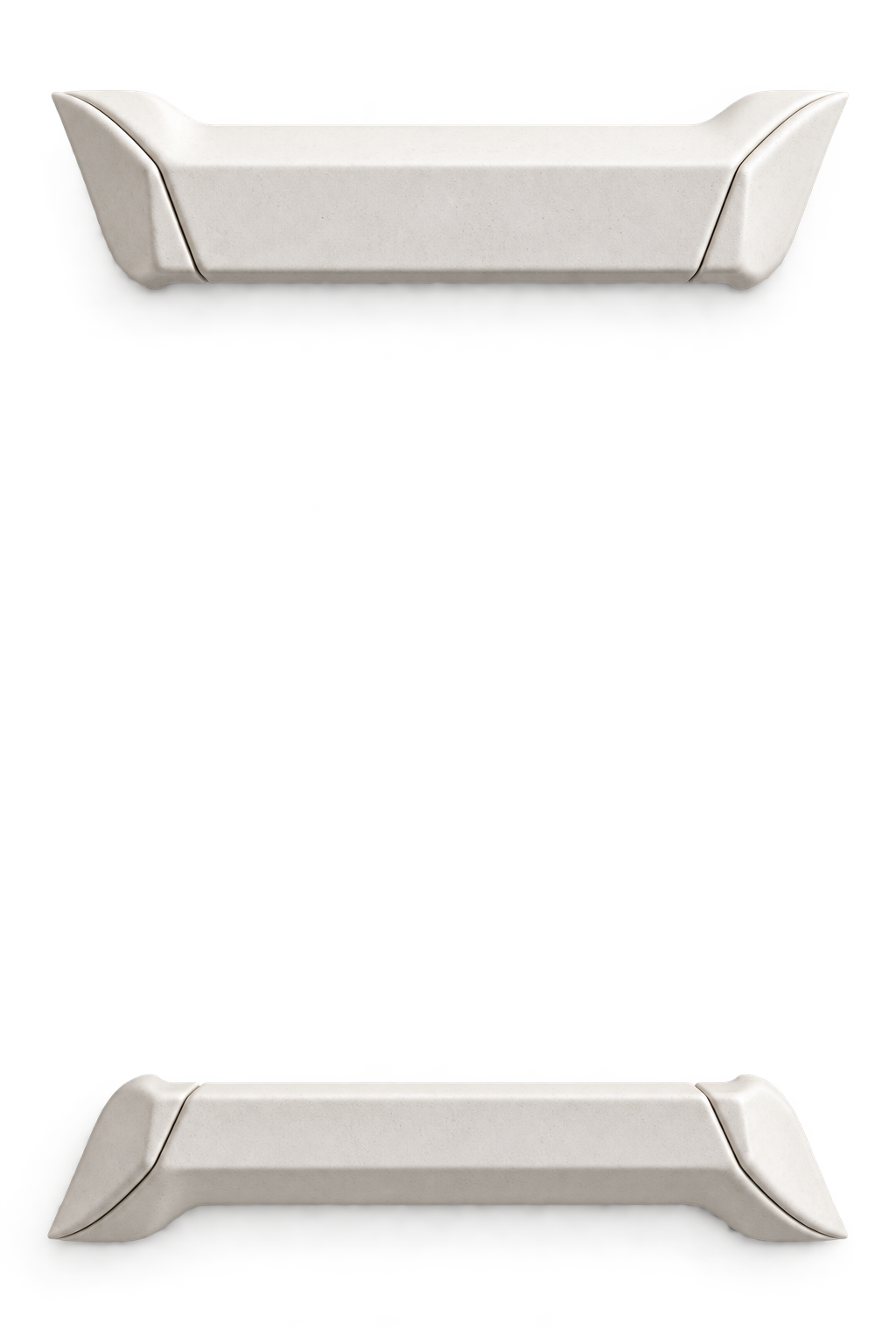
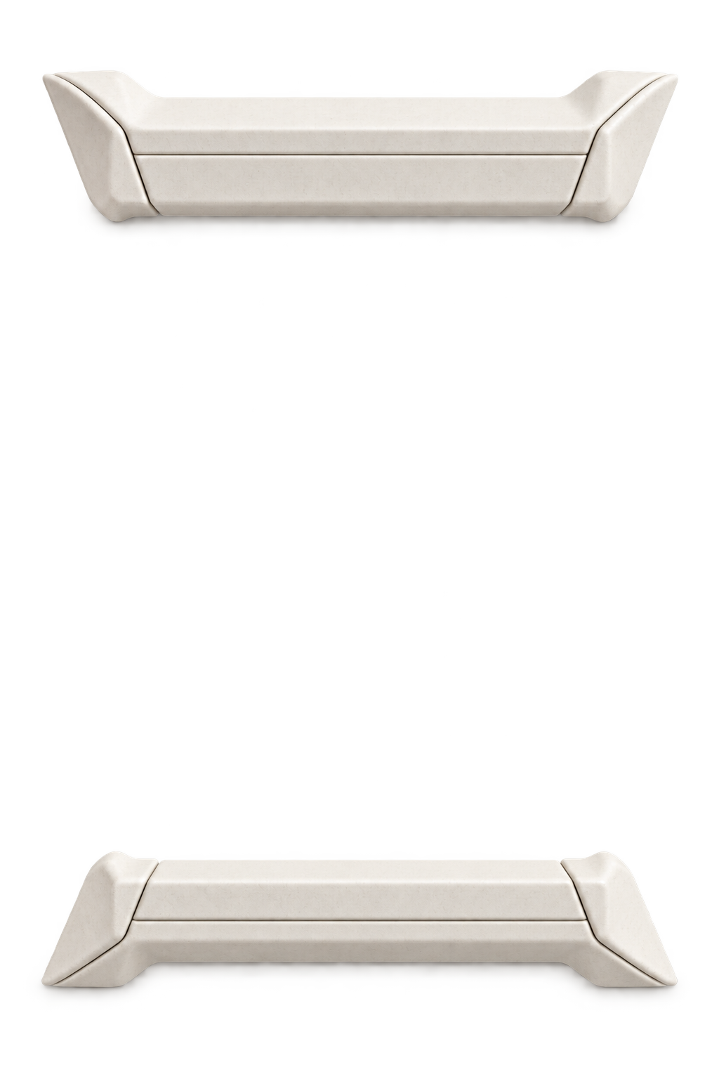
Porcelain channels with soft folds, resting on a light surface

02 / 03

MAGNAR

Two worlds.
One direction.

Type
Platform / website
Screens
23
Languages
14

Goal

Present a staffing agency as a business partner. Connect the needs of companies and candidates within one coherent communication system.

Audience

Industrial companies / owners / management / candidates

Scope

Strategy / UI/UX / Web / Motion / Content / Podcasts / Training materials

Color palette

  • #0d1b2e
  • #d4920a
  • #f0ede6
  • #9aa0a6
  • #ffffff

Why it looks this way

The project connects the perspectives of business and candidate. Motion guides attention, typography organizes information, and a clear structure makes the right path easy to find. Behind the system, there is still a person.

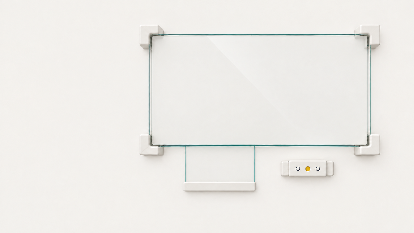
Thin glass sheet on four porcelain corners, with a small description panel and three controls below

01 / Foundation

Construction lines build the brand’s visual framework. The opening screen sets the rhythm, scale and language of the project. Everything that follows grows out of this system.

03 / 03

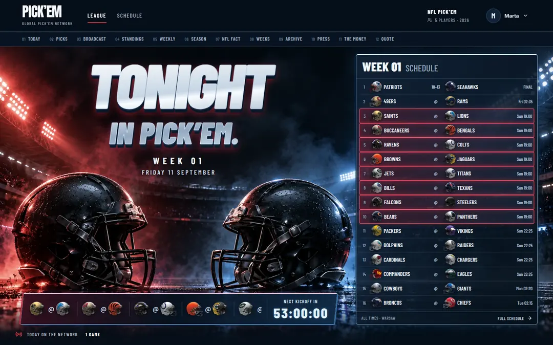
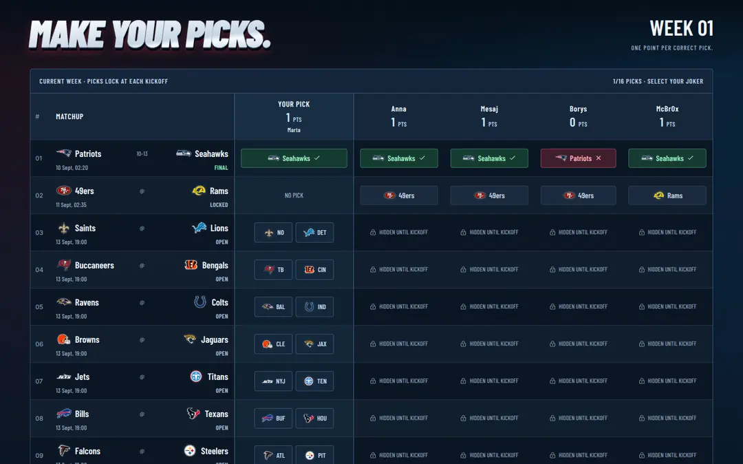
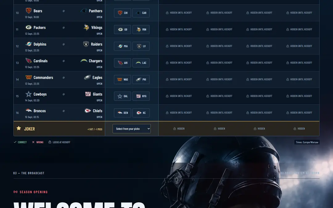
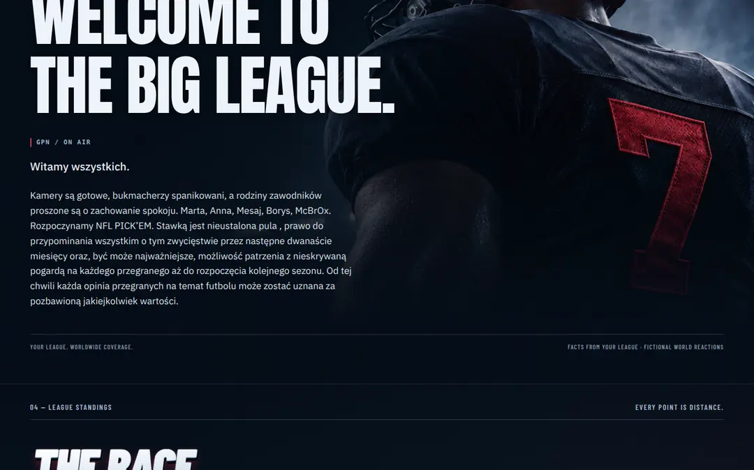
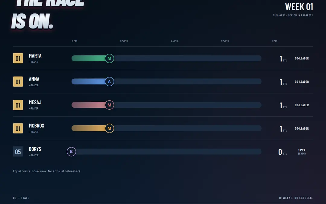
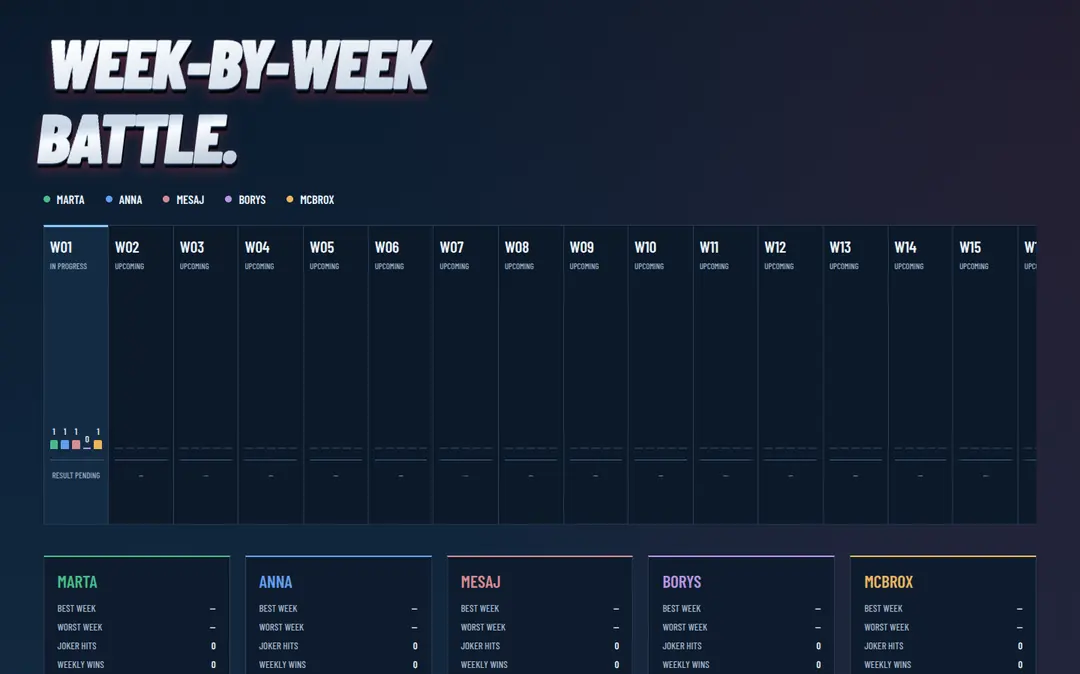
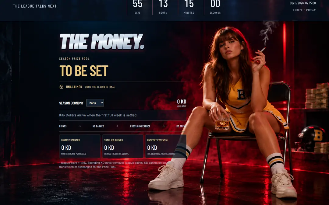
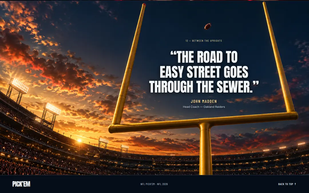
NFL PICK’EM

Broadcast, data and picks
combined in one system.

Type
Web application
Screens
12 main views
Audience
NFL fans / private leagues / Pick’em players

Goal

Turn game picks into a clear, engaging experience inspired by sports broadcasting.

Scope

Branding / Digital Product / UI System / Motion Direction

Color palette

  • #0d1b2e
  • #242827
  • #6c819e
  • #f0ede6
  • #9e2b2b

Why it looks this way

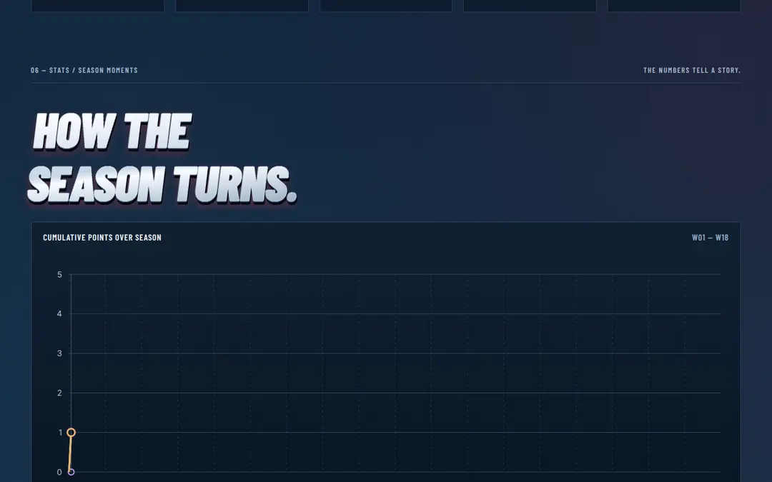
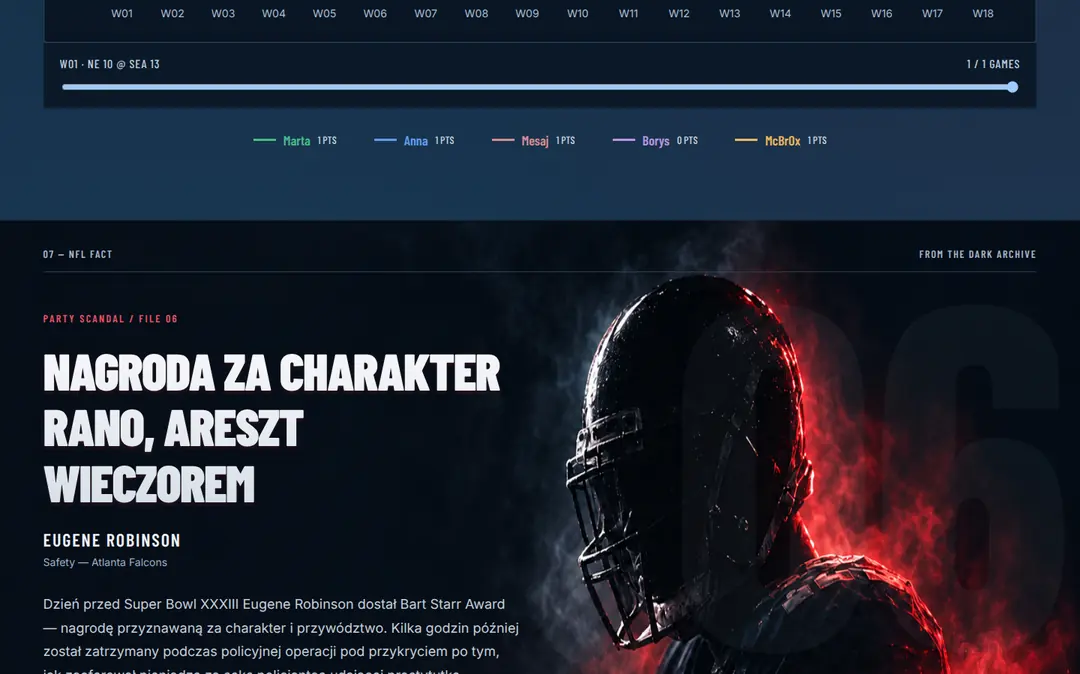
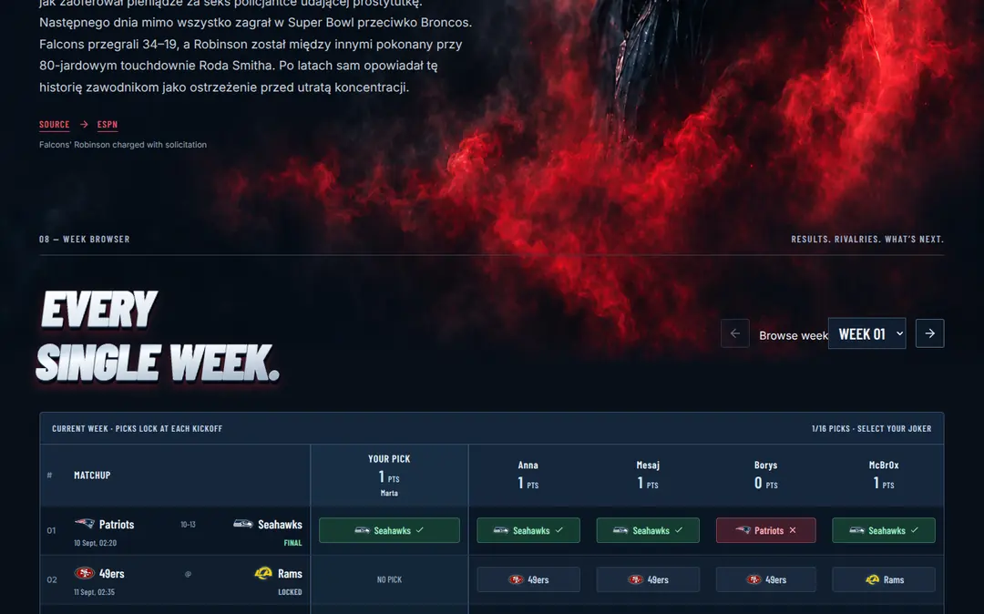
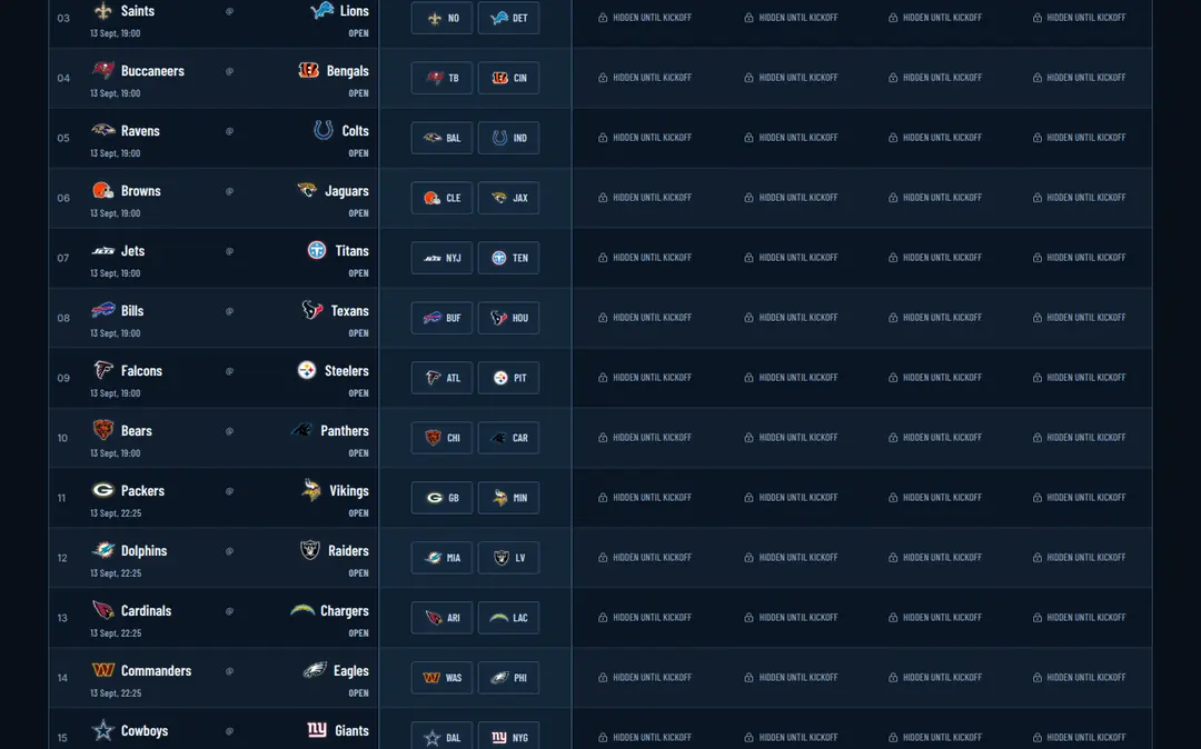
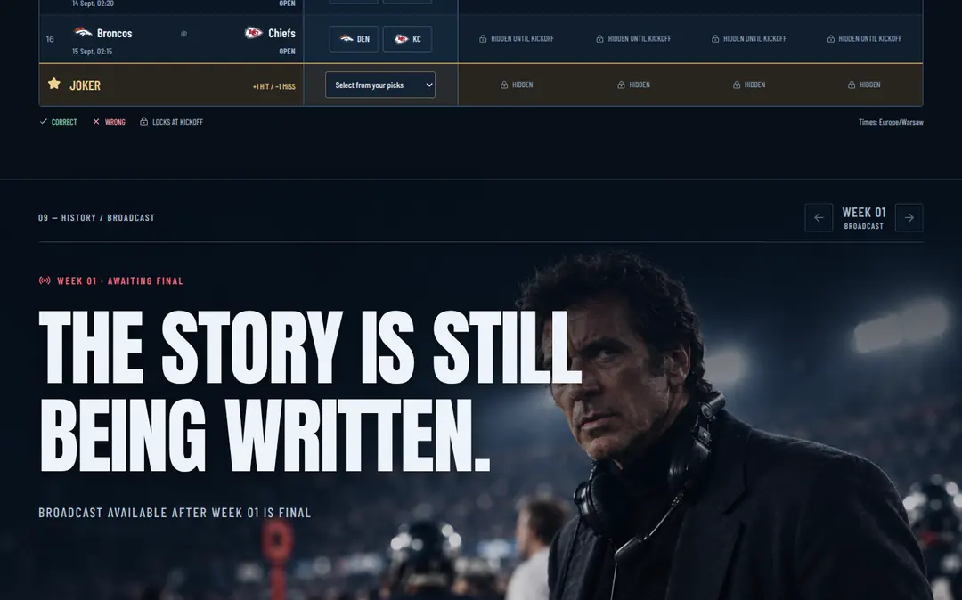
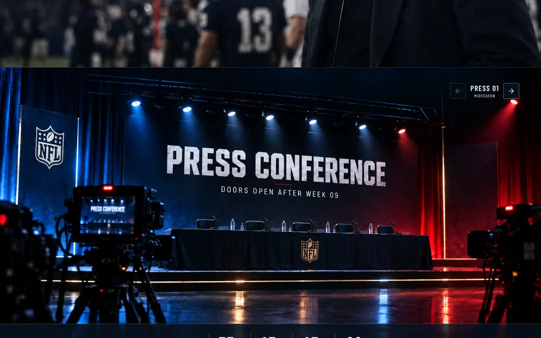
The project combines the language of sports broadcasting with interface clarity. A segmented structure, strong rhythm and controlled dynamics build tension without sacrificing readability. Data creates structure, while narrative turns the score into a story.

NFL PICK’EM — interface segment 1 of 14NFL PICK’EM — interface segment 2 of 14NFL PICK’EM — interface segment 3 of 14NFL PICK’EM — interface segment 4 of 14NFL PICK’EM — interface segment 5 of 14NFL PICK’EM — interface segment 6 of 14NFL PICK’EM — interface segment 7 of 14NFL PICK’EM — interface segment 8 of 14NFL PICK’EM — interface segment 9 of 14NFL PICK’EM — interface segment 10 of 14NFL PICK’EM — interface segment 11 of 14NFL PICK’EM — interface segment 12 of 14NFL PICK’EM — interface segment 13 of 14NFL PICK’EM — interface segment 14 of 14
Porcelanowe rynienki z subtelnym poziomym detalem

Perspective

Turn interest
into trust.

A referral, LinkedIn, a meeting, a message. In many business relationships, interest comes first. The website picks it up and turns it into the next impression.

01 / CONTEXT

First the name. Then the address.

Someone recommends your company. The conversation goes well. The name stays in mind. A moment later, the client opens your website.

They are checking you.

The website becomes a second meeting — one that happens without you, which means every part of the communication has to work on its own.

02 / FIRST IMPRESSION
50ms

Research on first impressions shows that an assessment of a website’s visual appeal can form almost instantly.

We see first. Only then do we start reading.

Composition, typography, rhythm and clarity are the first signals a viewer receives about a company.

03 / CREDIBILITY

Credibility has a form.

Research on website credibility shows that users pay attention to factors including professional appearance, clarity of information, the ability to verify the company and easy access to contact details.

Design shapes expectations. Form suggests what to expect from the company behind the screen.

Order suggests order. Consistency reinforces confidence in the decision.

Interest opens the conversation. The website carries it forward.
A good website takes the interest that already exists and moves it forward — toward trust.
“Perfection is achieved not when there is nothing more to add, but when there is nothing left to take away.”
Antoine de Saint-Exupéry

Good design should make
things clearer, not louder.

We remove what is unnecessary.
We strengthen what is important.
We design for people first.

BIELKOWSKI / Mikołaj

Creative Direction / Design / Branding

BROCKI / Miłosz

Strategy / Client Communication / Relationships

brocki / bielkowski design & brands